After way too long, I've finally revamped my website from the ground up. It's more streamlined, and much easier to update and navigate.
Check it out at: www.jerryrussell.com

Monday, July 25, 2011
Tuesday, July 19, 2011
Oops!!
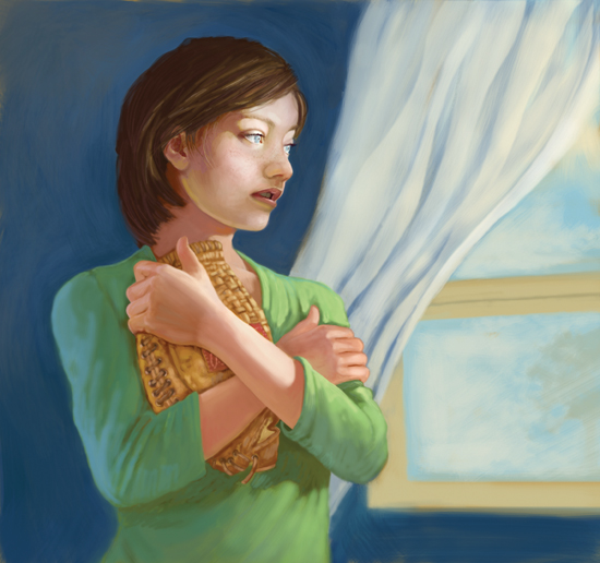
So . . . I just finished this cover illustration for Full Cast Audio's recording of Tunnel in the Sky, by Robert A. Heinlein. I was pretty happy with the result. Certainly more pleased with it than some of the paperback covers I've seen for this title.

A few days after submitting the art to the publisher, we get this email from a fellow with the Heinlein Prize Trust, explaining that, although they are very pleased with the cover, there is one problem with it. The boy depicted, Rod, who is the book's main character, is supposed to be, wait for it. . .
black.
Well, the boy on my cover certainly is not. YIPE!
In my defense...
Heinlein never mentions in the story what Rod's race is, and the couple clues he did include were very subtle. In fact –- every other cover done for this story (and there are a lot), depicts a white boy -- or in cases where the illustrator evidently skimmed the text instead of reading the story (several), -- a white man.
I read the book. I recommend it highly!
The only real clue in the text -- and this only applies to a pre 1970's mindset -- is that the girl in the story that everyone assumes will eventually end up as Rod's girlfriend, is black. So, by 1955 YA publishing standards (when this story was written) Rod must certainly also be black.
It is entirely possible (even probable) that Heinlein specifically didn't call out Rod's race so that readers in the 50s -- naturally assuming that Rod was white because he was the main character--- would be shocked by his interest in a black girl. Or, they would be shocked by the fact that the main character was black. Either way, Heinlein makes his point about racism.
I wasn't shocked, either way. Although, I did think that it was pretty forward-thinking of Heinlein to write a black and white relationship into a 1950s novel. But then, Heinlein was a forward-thinking kind of guy.
Before I start working on sketches for a cover. . .
I read the book. I also look at other covers to see what's been done so I don't come up with something too close to an existing concept. The paperback I read showed a white boy on the cover, as did all the covers I found. So before I even started reading the story, my preconception was that Rod was white.
Damn it! I hate being so far off target, but Heilnein, you set me up!!
SO... I scurried and did some quick repainting on the cover to make Rod black, and shot it off in an email to Bruce Coville (owner of Full Cast Audio, and a pretty darned famous author to boot). Bruce loved it and forwarded it to the Heinlein Trust.

They are quite pleased with the change. We'll use the new cover on the second run. Since these are produced in short runs, there won't be too many "wrong" covers of mine floating around. Maybe they'll become collectors items!
click image for larger view
A few days after submitting the art to the publisher, we get this email from a fellow with the Heinlein Prize Trust, explaining that, although they are very pleased with the cover, there is one problem with it. The boy depicted, Rod, who is the book's main character, is supposed to be, wait for it. . .
black.
Well, the boy on my cover certainly is not. YIPE!
In my defense...
Heinlein never mentions in the story what Rod's race is, and the couple clues he did include were very subtle. In fact –- every other cover done for this story (and there are a lot), depicts a white boy -- or in cases where the illustrator evidently skimmed the text instead of reading the story (several), -- a white man.
I read the book. I recommend it highly!
The only real clue in the text -- and this only applies to a pre 1970's mindset -- is that the girl in the story that everyone assumes will eventually end up as Rod's girlfriend, is black. So, by 1955 YA publishing standards (when this story was written) Rod must certainly also be black.
It is entirely possible (even probable) that Heinlein specifically didn't call out Rod's race so that readers in the 50s -- naturally assuming that Rod was white because he was the main character--- would be shocked by his interest in a black girl. Or, they would be shocked by the fact that the main character was black. Either way, Heinlein makes his point about racism.
I wasn't shocked, either way. Although, I did think that it was pretty forward-thinking of Heinlein to write a black and white relationship into a 1950s novel. But then, Heinlein was a forward-thinking kind of guy.
Before I start working on sketches for a cover. . .
I read the book. I also look at other covers to see what's been done so I don't come up with something too close to an existing concept. The paperback I read showed a white boy on the cover, as did all the covers I found. So before I even started reading the story, my preconception was that Rod was white.
Damn it! I hate being so far off target, but Heilnein, you set me up!!
SO... I scurried and did some quick repainting on the cover to make Rod black, and shot it off in an email to Bruce Coville (owner of Full Cast Audio, and a pretty darned famous author to boot). Bruce loved it and forwarded it to the Heinlein Trust.
They are quite pleased with the change. We'll use the new cover on the second run. Since these are produced in short runs, there won't be too many "wrong" covers of mine floating around. Maybe they'll become collectors items!
click image for larger view
Saturday, March 19, 2011
Score!

Here's a little tool I fashioned for scoring paper/cardboard prior to folding it. It makes for a clean, precise fold.
Cut off the end of a paper clip and clamp it in the business end of an X-acto handle. Use this tool to score along the fold lines of your project. Place a piece of mat board underneath the paper you're scoring to get a deeper score.
Wednesday, December 1, 2010
Wild Thing

This is the Max costume I made for Andrew when he was a seedling. He wore it to bed. A lot. I still have it around here somewhere. I think. I made several costumes for him when he was a tyke, including a full Renaissance costume for Fairy Tale Theater.
Saturday, July 10, 2010
Digital Paint
Audiobook cover for Rubber Houses.

Audiobook cover for Red Planet.

Syracuse Opera Poster for Faust.
Digital Paintings using Photoshop CS2/CS3 and Wacom Intuos II graphics tablet. Sketches for these were all done traditionally--pencil on paper. Color comps and final art were done digitally (Photoshop). A "comp" (short for comprehensive) is a rough study of what the final art will look like in place, with text and other design elements. It gives the client a good idea of composition, color, type placement & design, etc.
click images for larger view
Thursday, March 25, 2010

Friday, March 12, 2010
Marvel Milk
Subscribe to:
Comments (Atom)